Quick Links
Quick Links
The Navigation Problem
The Navigation Problem
The Navigation Problem
Design premise
Design premise
Design premise
Cairn began with a narrow design premise: reduce the interruption cost of checking direction while moving.
Cairn 从一个明确前提出发:降低行进中确认方向所带来的打断成本。
Problem — hiking repeats walk → doubt → stop → check → resume. Every check trades terrain attention for screen attention.
问题 — 徒步不断重复“行走 → 怀疑 → 停下 → 查看 → 继续”,每次查看都让注意力从地形转向屏幕。Focus — confirm direction while walking, rather than display more route information.
聚焦 — 在行走中确认方向,而不是展示更多路线信息。Scope — AR confirms; the phone plans; physical input stays available; swappable power carries the day.
范围 — AR 负责确认,手机负责规划,实体输入始终可用,可换电池支撑全天使用。
Cairn began with a narrow design premise: reduce the interruption cost of checking direction while moving.
Cairn 从一个明确前提出发:降低行进中确认方向所带来的打断成本。
Problem — hiking repeats walk → doubt → stop → check → resume. Every check trades terrain attention for screen attention.
问题 — 徒步不断重复“行走 → 怀疑 → 停下 → 查看 → 继续”,每次查看都让注意力从地形转向屏幕。Focus — confirm direction while walking, rather than display more route information.
聚焦 — 在行走中确认方向,而不是展示更多路线信息。Scope — AR confirms; the phone plans; physical input stays available; swappable power carries the day.
范围 — AR 负责确认,手机负责规划,实体输入始终可用,可换电池支撑全天使用。
Cairn began with a narrow design premise: reduce the interruption cost of checking direction while moving.
Cairn 从一个明确前提出发:降低行进中确认方向所带来的打断成本。
Problem — hiking repeats walk → doubt → stop → check → resume. Every check trades terrain attention for screen attention.
问题 — 徒步不断重复“行走 → 怀疑 → 停下 → 查看 → 继续”,每次查看都让注意力从地形转向屏幕。Focus — confirm direction while walking, rather than display more route information.
聚焦 — 在行走中确认方向,而不是展示更多路线信息。Scope — AR confirms; the phone plans; physical input stays available; swappable power carries the day.
范围 — AR 负责确认,手机负责规划,实体输入始终可用,可换电池支撑全天使用。
System at a glance
System at a glance
System at a glance
AR interface — one landmark, one direction range, and escalation only when risk rises.
AR 界面 — 一个地标、一个方向范围,只在风险升高时升级提示。Phone — route planning, trail conditions, offline sync, and readiness checks before departure or at rest.
手机 — 在出发前或休息时完成路线规划、步道状况、离线同步与准备检查。Wearable system — quick physical input, mid-temple swappable batteries, a shoulder-strap dock, and a 1:1 model.
可穿戴系统 — 快速实体输入、镜腿中段可换电池、肩带充电坞与 1:1 模型。Evidence — two surveys, six interviews, a six-person ergonomic study, and a seven-person prototype evaluation.
证据 — 两轮问卷、6 次访谈、6 人人因实验与 7 人原型评估;每项发现都标注有效样本数。
System walkthrough
System walkthrough
System walkthrough
The system assigns each surface a different interruption budget. Dense work stays off the moving view.
系统为每个载体分配不同的打断预算;高密度任务不进入行进视野。
Phone — route planning, trail conditions, offline sync, and readiness checks before departure or at rest.
手机 — 在出发前或休息时完成路线规划、步道状况、离线同步与准备检查。AR glasses — one landmark, one direction range, and escalation only when risk rises.
AR 眼镜 — 一个地标、一个方向范围,只在风险上升时升级提示。Wristband — quick physical confirmation without reaching for a phone.
腕带 — 无需掏出手机即可完成快速实体确认。Dock + batteries — shoulder-strap storage and one-handed power swaps for an 8–12 hour day.
充电坞 + 电池 — 肩带收纳与单手换电,支撑 8–12 小时徒步。
Operating rule — use the least interruptive surface that can still resolve the moment.
运行规则 — 优先使用能解决当下问题、同时打断最少的载体。
The system assigns each surface a different interruption budget. Dense work stays off the moving view.
系统为每个载体分配不同的打断预算;高密度任务不进入行进视野。
Phone — route planning, trail conditions, offline sync, and readiness checks before departure or at rest.
手机 — 在出发前或休息时完成路线规划、步道状况、离线同步与准备检查。AR glasses — one landmark, one direction range, and escalation only when risk rises.
AR 眼镜 — 一个地标、一个方向范围,只在风险上升时升级提示。Wristband — quick physical confirmation without reaching for a phone.
腕带 — 无需掏出手机即可完成快速实体确认。Dock + batteries — shoulder-strap storage and one-handed power swaps for an 8–12 hour day.
充电坞 + 电池 — 肩带收纳与单手换电,支撑 8–12 小时徒步。
Operating rule — use the least interruptive surface that can still resolve the moment.
运行规则 — 优先使用能解决当下问题、同时打断最少的载体。
The system assigns each surface a different interruption budget. Dense work stays off the moving view.
系统为每个载体分配不同的打断预算;高密度任务不进入行进视野。
Phone — route planning, trail conditions, offline sync, and readiness checks before departure or at rest.
手机 — 在出发前或休息时完成路线规划、步道状况、离线同步与准备检查。AR glasses — one landmark, one direction range, and escalation only when risk rises.
AR 眼镜 — 一个地标、一个方向范围,只在风险上升时升级提示。Wristband — quick physical confirmation without reaching for a phone.
腕带 — 无需掏出手机即可完成快速实体确认。Dock + batteries — shoulder-strap storage and one-handed power swaps for an 8–12 hour day.
充电坞 + 电池 — 肩带收纳与单手换电,支撑 8–12 小时徒步。
Operating rule — use the least interruptive surface that can still resolve the moment.
运行规则 — 优先使用能解决当下问题、同时打断最少的载体。


Interaction decisions
Interaction decisions
Interaction decisions
Hikers did not ask technology to replace terrain reading. The opportunity was to help them connect what they see with what they should do next.
徒步者并不需要技术替代地形判断;机会在于帮助他们把眼前地形与下一步行动连接起来。
Existing skill — 95/113 already use ridges, slopes, and vegetation to orient themselves.
已有能力 — 95/113 的受访者已经会利用山脊、坡度与植被判断方向。Recognition — 86/97 can read contour lines; 84/97 set anchor points when planning.
识别能力 — 86/97 能阅读等高线,84/97 会在规划时设置锚点。Reasoning gap — only 67/97 identify fall lines, the lowest terrain-skill item.
推理缺口 — 仅 67/97 能识别落水线,是地形能力题中最低的一项。
Design principle — augment existing skill; do not automate it away.
设计原则 — 增强已有能力,而不是用自动化替代它。
Hikers did not ask technology to replace terrain reading. The opportunity was to help them connect what they see with what they should do next.
徒步者并不需要技术替代地形判断;机会在于帮助他们把眼前地形与下一步行动连接起来。
Existing skill — 95/113 already use ridges, slopes, and vegetation to orient themselves.
已有能力 — 95/113 的受访者已经会利用山脊、坡度与植被判断方向。Recognition — 86/97 can read contour lines; 84/97 set anchor points when planning.
识别能力 — 86/97 能阅读等高线,84/97 会在规划时设置锚点。Reasoning gap — only 67/97 identify fall lines, the lowest terrain-skill item.
推理缺口 — 仅 67/97 能识别落水线,是地形能力题中最低的一项。
Design principle — augment existing skill; do not automate it away.
设计原则 — 增强已有能力,而不是用自动化替代它。
Decision 1 — Confirm terrain, don’t replace it
Decision 1 — Confirm terrain, don’t replace it
Decision 1 — Confirm terrain, don’t replace it
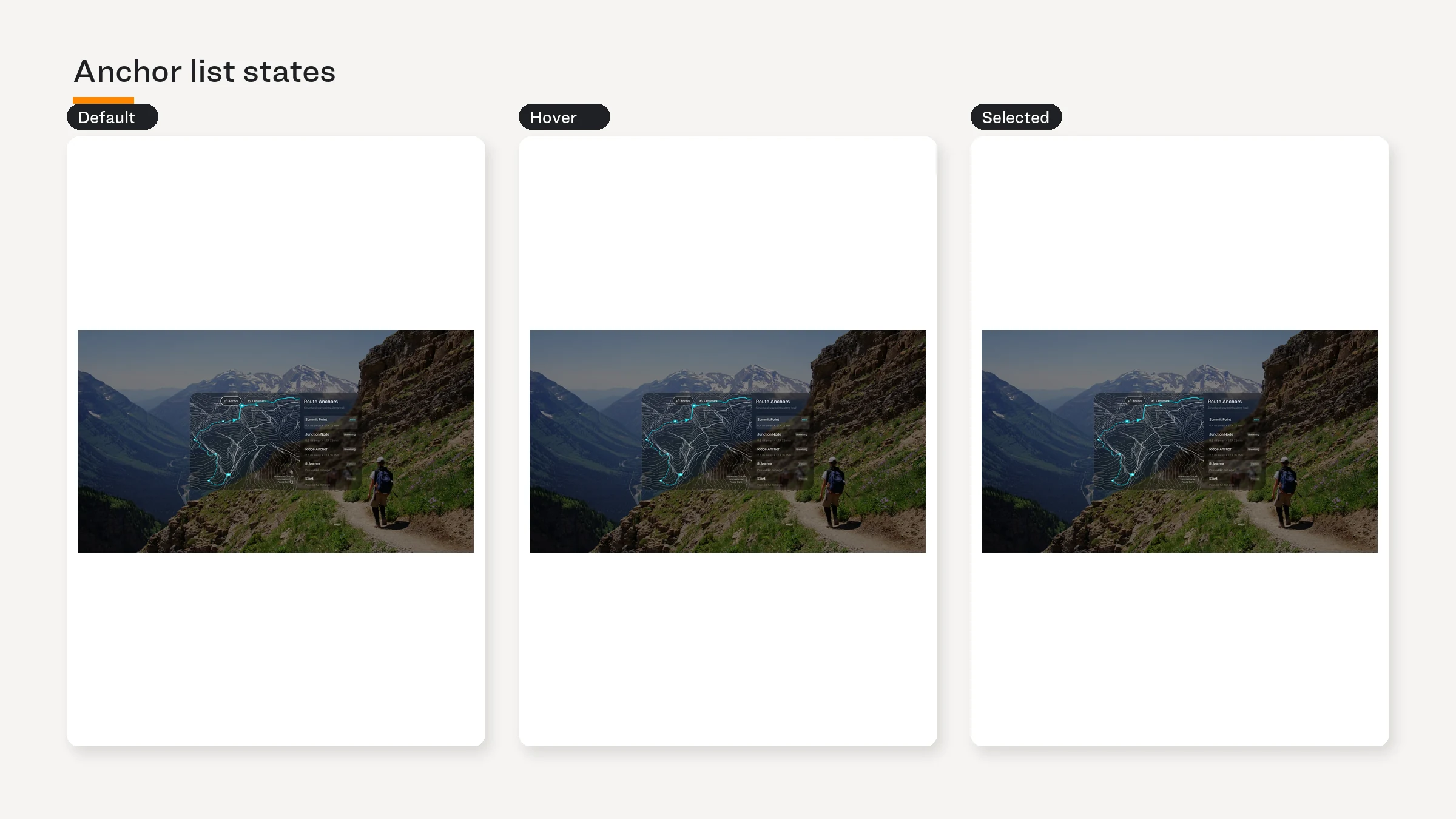
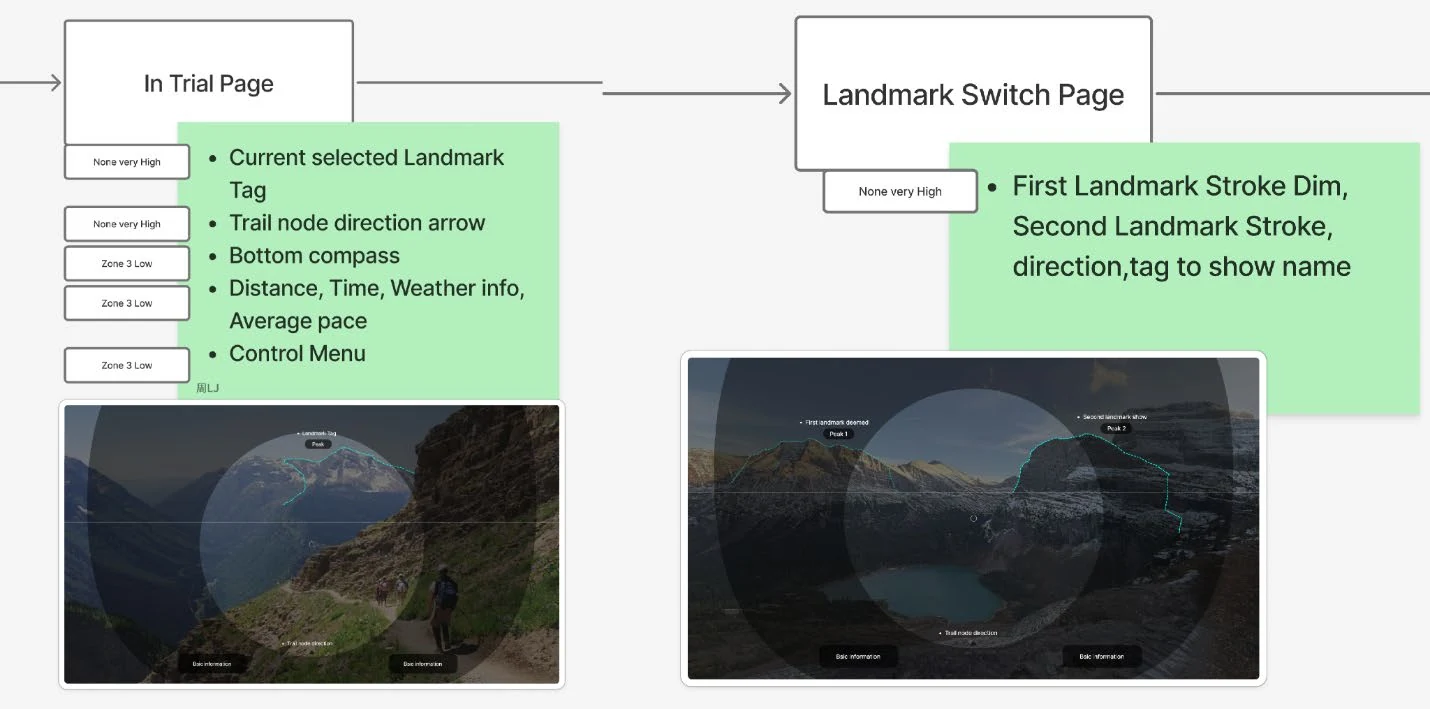
The field of view is a constraint, not a canvas. Cairn shows only what helps a hiker confirm direction in the current moment.
视野是一项约束,不是画布。Cairn 只显示能帮助徒步者在当下确认方向的信息。
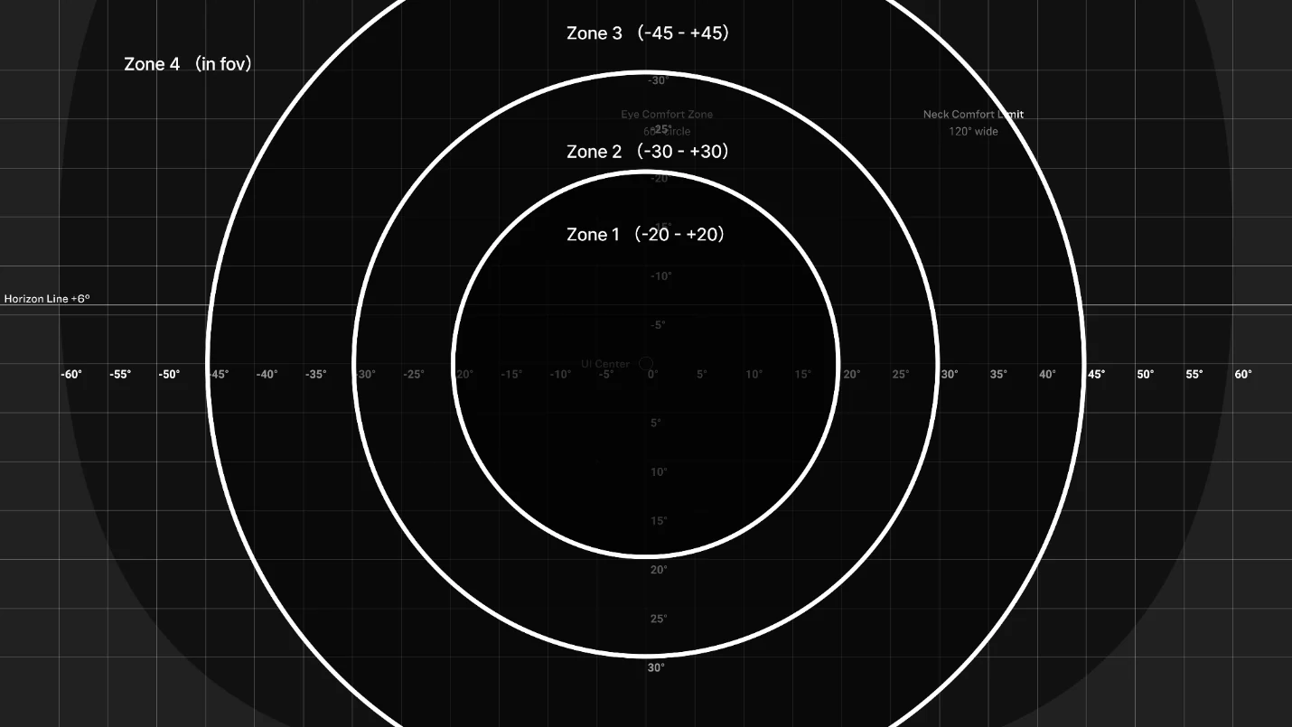
Default — one target landmark, a bearing range, and minimal status.
默认状态 — 一个目标地标、一个方向范围与最少量状态信息。Zoning — primary guidance stays within ±20°; lower-priority information moves outward.
分区 — 主要引导保持在 ±20° 内,低优先级信息向外移动。Correctness — highlights confirm visible terrain; arrows appear only when the landmark cannot be seen.
正确性 — 看得见地标时用高亮确认;只有地标不可见时才出现箭头。
The field of view is a constraint, not a canvas. Cairn shows only what helps a hiker confirm direction in the current moment.
视野是一项约束,不是画布。Cairn 只显示能帮助徒步者在当下确认方向的信息。
Default — one target landmark, a bearing range, and minimal status.
默认状态 — 一个目标地标、一个方向范围与最少量状态信息。Zoning — primary guidance stays within ±20°; lower-priority information moves outward.
分区 — 主要引导保持在 ±20° 内,低优先级信息向外移动。Correctness — highlights confirm visible terrain; arrows appear only when the landmark cannot be seen.
正确性 — 看得见地标时用高亮确认;只有地标不可见时才出现箭头。
The field of view is a constraint, not a canvas. Cairn shows only what helps a hiker confirm direction in the current moment.
视野是一项约束,不是画布。Cairn 只显示能帮助徒步者在当下确认方向的信息。
Default — one target landmark, a bearing range, and minimal status.
默认状态 — 一个目标地标、一个方向范围与最少量状态信息。Zoning — primary guidance stays within ±20°; lower-priority information moves outward.
分区 — 主要引导保持在 ±20° 内,低优先级信息向外移动。Correctness — highlights confirm visible terrain; arrows appear only when the landmark cannot be seen.
正确性 — 看得见地标时用高亮确认;只有地标不可见时才出现箭头。
Default in-trail view
Default in-trail view
Default in-trail view

Landmark confirmed — heading correct
Landmark confirmed — heading correct
Landmark confirmed — heading correct

Landmark confirmed — heading wrong
Landmark confirmed — heading wrong
Landmark confirmed — heading wrong
Direction Range on the compass
Direction Range on the compass
Direction Range on the compass

Switch Landmark — why this one
Switch Landmark — why this one
Switch Landmark — why this one
Zoning — ±20° / ±30° / ±45°
Zoning — ±20° / ±30° / ±45°
Zoning — ±20° / ±30° / ±45°
The adoption trade-off
The adoption trade-off
The adoption trade-off
The surveys did not validate demand for AR. They exposed a conflict between preferred hardware and attention behavior.
调研并没有验证 AR 需求;它揭示了偏好的硬件与注意力行为之间的冲突。
The surveys did not validate demand for AR. They exposed a conflict between preferred hardware and attention behavior.
调研并没有验证 AR 需求;它揭示了偏好的硬件与注意力行为之间的冲突。
The surveys did not validate demand for AR. They exposed a conflict between preferred hardware and attention behavior.
调研并没有验证 AR 需求;它揭示了偏好的硬件与注意力行为之间的冲突。


Why AR still earns one narrow role
Why AR still earns one narrow role
Why AR still earns one narrow role
AR was not chosen to replace physical input. It was kept for one moment the phone handles poorly: confirming direction while walking.
AR 并非用来取代实体输入;它只服务于手机处理不好的一个时刻:人在行走中确认方向。
Phone — remains the place for route planning, comparison, and detailed recovery.
手机 — 继续承担路线规划、方案比较与详细恢复操作。Physical input — remains available for reliable control in rain, cold, gloves, or fatigue.
实体输入 — 在雨天、寒冷、戴手套或疲劳时继续提供可靠控制。AR — earns one narrow role: glanceable confirmation when looking down would cost terrain attention.
AR — 只保留一个狭窄角色:当低头会牺牲地形注意力时,提供一眼可读的方向确认。
AR was not chosen to replace physical input. It was kept for one moment the phone handles poorly: confirming direction while walking.
AR 并非用来取代实体输入;它只服务于手机处理不好的一个时刻:人在行走中确认方向。
Phone — remains the place for route planning, comparison, and detailed recovery.
手机 — 继续承担路线规划、方案比较与详细恢复操作。Physical input — remains available for reliable control in rain, cold, gloves, or fatigue.
实体输入 — 在雨天、寒冷、戴手套或疲劳时继续提供可靠控制。AR — earns one narrow role: glanceable confirmation when looking down would cost terrain attention.
AR — 只保留一个狭窄角色:当低头会牺牲地形注意力时,提供一眼可读的方向确认。
AR was not chosen to replace physical input. It was kept for one moment the phone handles poorly: confirming direction while walking.
AR 并非用来取代实体输入;它只服务于手机处理不好的一个时刻:人在行走中确认方向。
Phone — remains the place for route planning, comparison, and detailed recovery.
手机 — 继续承担路线规划、方案比较与详细恢复操作。Physical input — remains available for reliable control in rain, cold, gloves, or fatigue.
实体输入 — 在雨天、寒冷、戴手套或疲劳时继续提供可靠控制。AR — earns one narrow role: glanceable confirmation when looking down would cost terrain attention.
AR — 只保留一个狭窄角色:当低头会牺牲地形注意力时,提供一眼可读的方向确认。
Accepted risk — this is a design hypothesis, not product-market validation. AR-specific answers came from a self-selected subgroup (n≈31).
接受的风险 — 这是设计假设,不是产品市场验证。AR 相关回答来自自选子样本(n≈31)。
Accepted risk — this is a design hypothesis, not product-market validation. AR-specific answers came from a self-selected subgroup (n≈31).
接受的风险 — 这是设计假设,不是产品市场验证。AR 相关回答来自自选子样本(n≈31)。
Accepted risk — this is a design hypothesis, not product-market validation. AR-specific answers came from a self-selected subgroup (n≈31).
接受的风险 — 这是设计假设,不是产品市场验证。AR 相关回答来自自选子样本(n≈31)。
Decision 2 — Keep planning on the phone
Decision 2 — Keep planning on the phone
Decision 2 — Keep planning on the phone
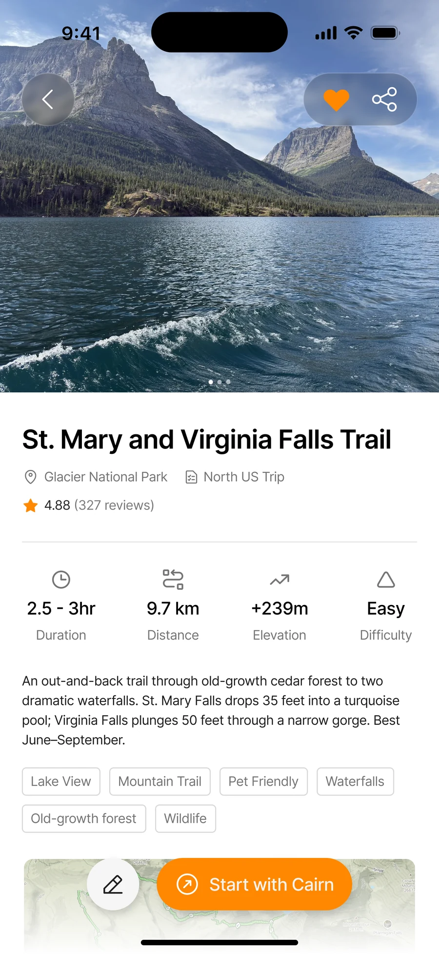
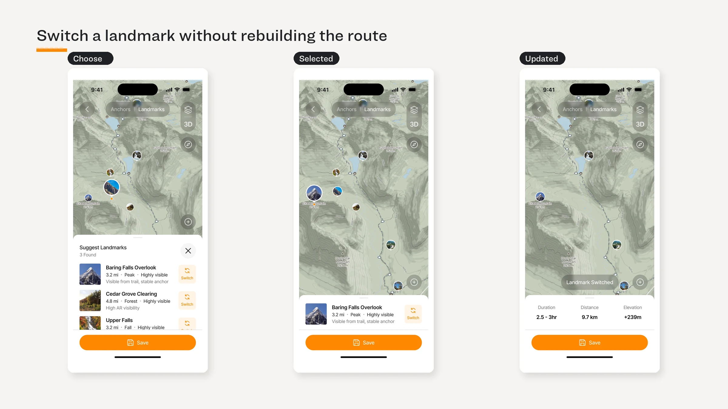
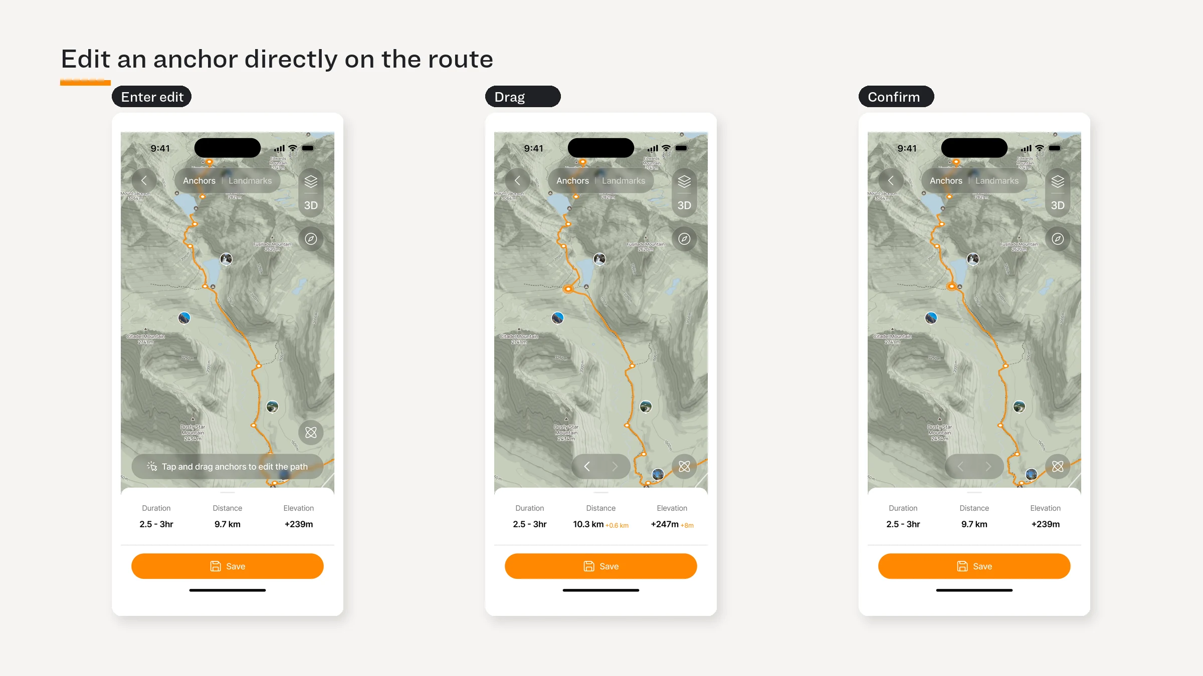
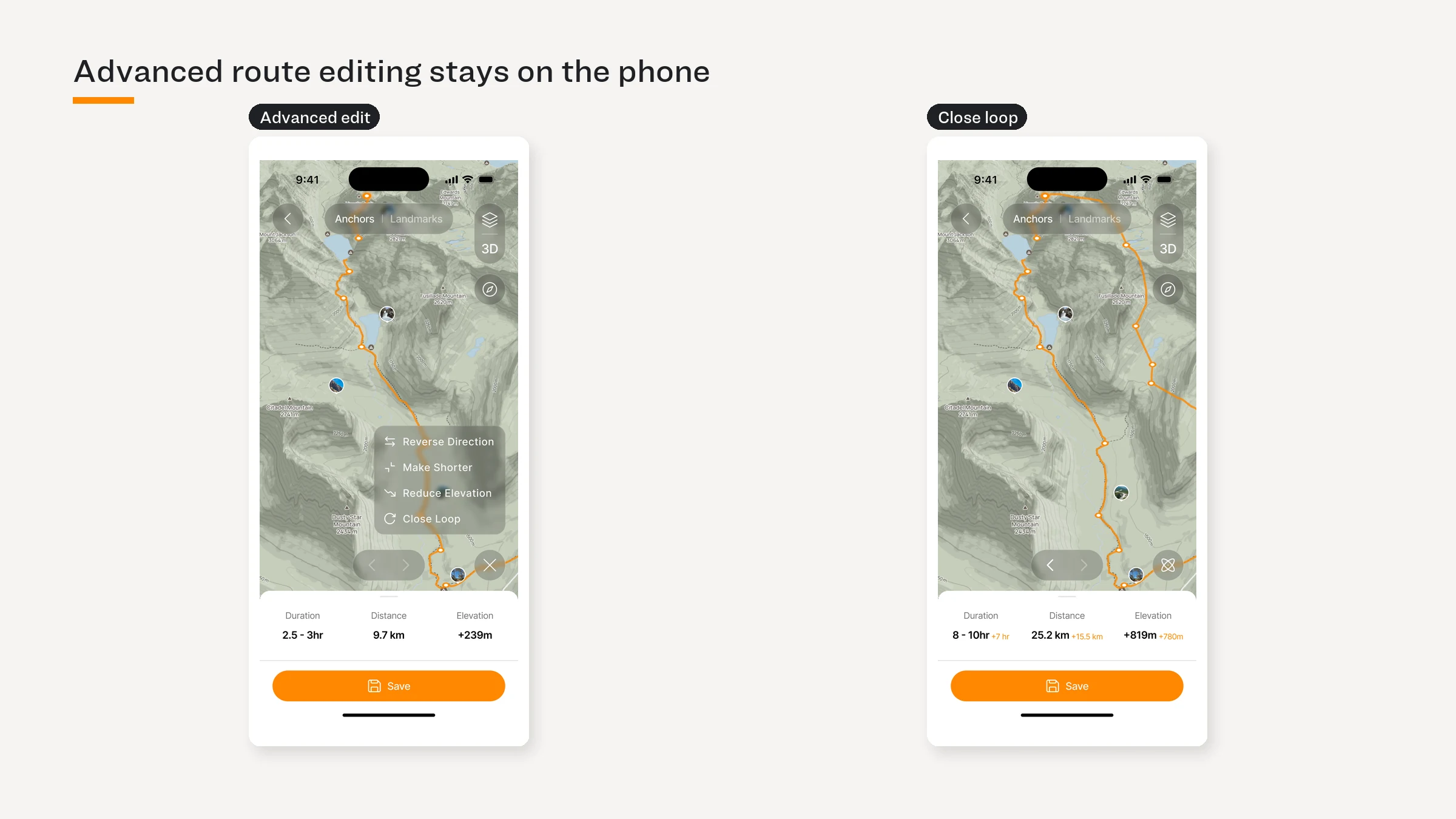
Dense planning stays on the phone so the glasses can stay quiet.
高密度规划留在手机端,让眼镜界面保持安静。
Planning — inspect the route, trail conditions, landmarks, and alternatives.
规划 — 查看路线、步道状况、地标与备选方案。Readiness — download maps, confirm landmarks, and check devices before departure.
准备 — 出发前下载地图、确认地标并检查设备。Input — edit anchors and switch landmarks with direct manipulation.
输入 — 通过直接操作编辑锚点与切换地标。Boundary — route rebuilding and dense comparison never move into AR.
边界 — 路线重建与高密度比较不进入 AR。
Dense planning stays on the phone so the glasses can stay quiet.
高密度规划留在手机端,让眼镜界面保持安静。
Planning — inspect the route, trail conditions, landmarks, and alternatives.
规划 — 查看路线、步道状况、地标与备选方案。Readiness — download maps, confirm landmarks, and check devices before departure.
准备 — 出发前下载地图、确认地标并检查设备。Input — edit anchors and switch landmarks with direct manipulation.
输入 — 通过直接操作编辑锚点与切换地标。Boundary — route rebuilding and dense comparison never move into AR.
边界 — 路线重建与高密度比较不进入 AR。
Dense planning stays on the phone so the glasses can stay quiet.
高密度规划留在手机端,让眼镜界面保持安静。
Planning — inspect the route, trail conditions, landmarks, and alternatives.
规划 — 查看路线、步道状况、地标与备选方案。Readiness — download maps, confirm landmarks, and check devices before departure.
准备 — 出发前下载地图、确认地标并检查设备。Input — edit anchors and switch landmarks with direct manipulation.
输入 — 通过直接操作编辑锚点与切换地标。Boundary — route rebuilding and dense comparison never move into AR.
边界 — 路线重建与高密度比较不进入 AR。



When the system must intervene
When the system must intervene
When the system must intervene
One rule governs every failure state: let hikers self-correct first; escalate only when needed.
所有失败状态遵循同一条规则:先让徒步者自行纠正,只在必要时升级提示。
One rule governs every failure state: let hikers self-correct first; escalate only when needed.
所有失败状态遵循同一条规则:先让徒步者自行纠正,只在必要时升级提示。
One rule governs every failure state: let hikers self-correct first; escalate only when needed.
所有失败状态遵循同一条规则:先让徒步者自行纠正,只在必要时升级提示。
Landmark not visible
Landmark not visible
Landmark not visible
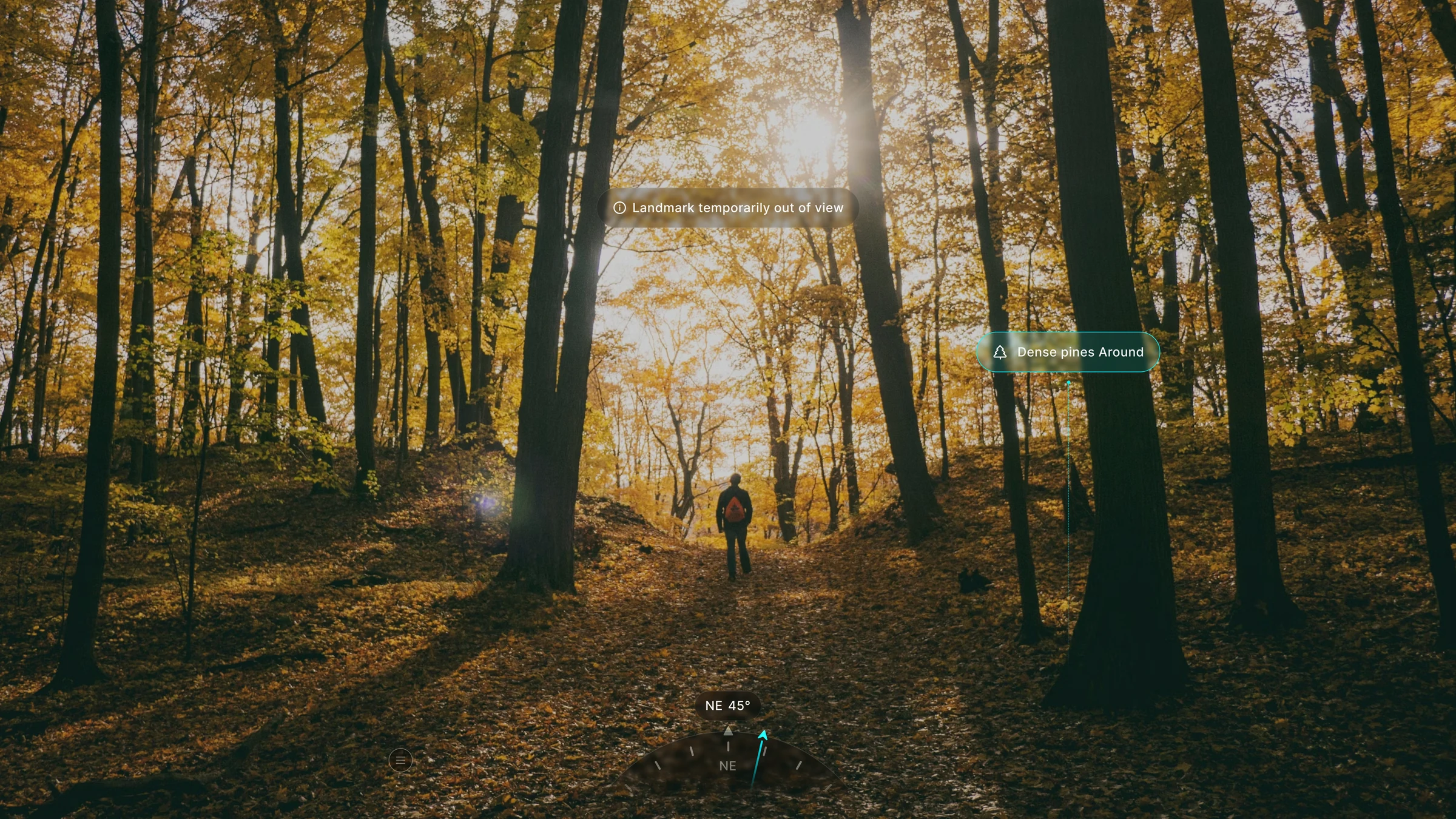
Trigger — the planned landmark is hidden by terrain or weather.
触发 — 计划中的地标被地形或天气遮挡。First signal — replace the highlight with a restrained directional cue.
第一层提示 — 用克制的方向提示替代地标高亮。Escalation — reveal more context only when the hiker cannot recover from the light cue.
升级 — 只有轻提示无法帮助恢复时,才展示更多上下文。
Trigger — the planned landmark is hidden by terrain or weather.
触发 — 计划中的地标被地形或天气遮挡。First signal — replace the highlight with a restrained directional cue.
第一层提示 — 用克制的方向提示替代地标高亮。Escalation — reveal more context only when the hiker cannot recover from the light cue.
升级 — 只有轻提示无法帮助恢复时,才展示更多上下文。
Trigger — the planned landmark is hidden by terrain or weather.
触发 — 计划中的地标被地形或天气遮挡。First signal — replace the highlight with a restrained directional cue.
第一层提示 — 用克制的方向提示替代地标高亮。Escalation — reveal more context only when the hiker cannot recover from the light cue.
升级 — 只有轻提示无法帮助恢复时,才展示更多上下文。
Off route
Off route
Off route
Trigger — the hiker leaves the planned route.
触发 — 徒步者偏离计划路线。First signal — a low-intensity red halo appears at the edge while the center stays clear.
第一层提示 — 低强度红色光晕出现在视野边缘,中心区域保持清晰。Escalation — if the hiker does not return, offer snooze, a new trail, or backtracking.
升级 — 若仍未返回路线,提供暂缓、新路线或原路返回。
Trigger — the hiker leaves the planned route.
触发 — 徒步者偏离计划路线。First signal — a low-intensity red halo appears at the edge while the center stays clear.
第一层提示 — 低强度红色光晕出现在视野边缘,中心区域保持清晰。Escalation — if the hiker does not return, offer snooze, a new trail, or backtracking.
升级 — 若仍未返回路线,提供暂缓、新路线或原路返回。
Trigger — the hiker leaves the planned route.
触发 — 徒步者偏离计划路线。First signal — a low-intensity red halo appears at the edge while the center stays clear.
第一层提示 — 低强度红色光晕出现在视野边缘,中心区域保持清晰。Escalation — if the hiker does not return, offer snooze, a new trail, or backtracking.
升级 — 若仍未返回路线,提供暂缓、新路线或原路返回。
Weather
Weather
Weather
Trigger — the on-device sensor detects a meaningful weather change.
触发 — 设备传感器检测到有意义的天气变化。First signal — a lightweight prompt appears at the top of the view.
第一层提示 — 视野顶部出现轻量提示。Escalation — if ignored, prompt once more, then reveal cloud, precipitation, and wind layers only when justified.
升级 — 被忽略后再提示一次,仅在必要时展开云层、降水与风况图层。
Trigger — the on-device sensor detects a meaningful weather change.
触发 — 设备传感器检测到有意义的天气变化。First signal — a lightweight prompt appears at the top of the view.
第一层提示 — 视野顶部出现轻量提示。Escalation — if ignored, prompt once more, then reveal cloud, precipitation, and wind layers only when justified.
升级 — 被忽略后再提示一次,仅在必要时展开云层、降水与风况图层。
Trigger — the on-device sensor detects a meaningful weather change.
触发 — 设备传感器检测到有意义的天气变化。First signal — a lightweight prompt appears at the top of the view.
第一层提示 — 视野顶部出现轻量提示。Escalation — if ignored, prompt once more, then reveal cloud, precipitation, and wind layers only when justified.
升级 — 被忽略后再提示一次,仅在必要时展开云层、降水与风况图层。
Alerts — where the line sits
Alerts — where the line sits
Alerts — where the line sits
Alerts are not a constant stream. They appear only when dangerous terrain or an incoming storm changes what the hiker should do next.
提醒不是持续的信息流;只有危险地形或即将到来的风暴改变下一步行动时才会出现。
Alerts are not a constant stream. They appear only when dangerous terrain or an incoming storm changes what the hiker should do next.
提醒不是持续的信息流;只有危险地形或即将到来的风暴改变下一步行动时才会出现。
Alerts are not a constant stream. They appear only when dangerous terrain or an incoming storm changes what the hiker should do next.
提醒不是持续的信息流;只有危险地形或即将到来的风暴改变下一步行动时才会出现。

Power & wearability
Power & wearability
Power & wearability
An 8–12 hour hiking day makes power distribution a wearability constraint. This section is backed by Cairn’s only primary ergonomic study.
一次 8–12 小时的徒步让供电分配成为可穿戴体验约束。本节由 Cairn 唯一的一手人因实验支撑。
An 8–12 hour hiking day makes power distribution a wearability constraint. This section is backed by Cairn’s only primary ergonomic study.
一次 8–12 小时的徒步让供电分配成为可穿戴体验约束。本节由 Cairn 唯一的一手人因实验支撑。
An 8–12 hour hiking day makes power distribution a wearability constraint. This section is backed by Cairn’s only primary ergonomic study.
一次 8–12 小时的徒步让供电分配成为可穿戴体验约束。本节由 Cairn 唯一的一手人因实验支撑。
Decision 3 — Treat power as a field operation
Decision 3 — Treat power as a field operation
Decision 3 — Treat power as a field operation
The battery decision was not “where it fits.” It was where weight can be tolerated and swapped while moving.
电池决策并不是“哪里放得下”,而是重量在哪里更可承受、并能在行进中完成更换。
Benchmark — existing smart glasses ranged from 39.7 g to 96.4 g, making face weight a first-order constraint.
基准 — 现有智能眼镜重量约为 39.7–96.4 g,面部负重因此成为首要约束。Evidence — a six-person ergonomic study compared four battery positions with simulated battery and PCB weight.
证据 — 6 人实验用模拟电池与 PCB 重量比较了四个电池位置。Strategy — move energy to a mid-temple module and recharge by swapping, not by stopping.
策略 — 将能量移至镜腿中段,通过换电续航,而不是停下来充电。
The battery decision was not “where it fits.” It was where weight can be tolerated and swapped while moving.
电池决策并不是“哪里放得下”,而是重量在哪里更可承受、并能在行进中完成更换。
Benchmark — existing smart glasses ranged from 39.7 g to 96.4 g, making face weight a first-order constraint.
基准 — 现有智能眼镜重量约为 39.7–96.4 g,面部负重因此成为首要约束。Evidence — a six-person ergonomic study compared four battery positions with simulated battery and PCB weight.
证据 — 6 人实验用模拟电池与 PCB 重量比较了四个电池位置。Strategy — move energy to a mid-temple module and recharge by swapping, not by stopping.
策略 — 将能量移至镜腿中段,通过换电续航,而不是停下来充电。
The battery decision was not “where it fits.” It was where weight can be tolerated and swapped while moving.
电池决策并不是“哪里放得下”,而是重量在哪里更可承受、并能在行进中完成更换。
Benchmark — existing smart glasses ranged from 39.7 g to 96.4 g, making face weight a first-order constraint.
基准 — 现有智能眼镜重量约为 39.7–96.4 g,面部负重因此成为首要约束。Evidence — a six-person ergonomic study compared four battery positions with simulated battery and PCB weight.
证据 — 6 人实验用模拟电池与 PCB 重量比较了四个电池位置。Strategy — move energy to a mid-temple module and recharge by swapping, not by stopping.
策略 — 将能量移至镜腿中段,通过换电续航,而不是停下来充电。



Choose the battery position and swap mechanism
Choose the battery position and swap mechanism
Choose the battery position and swap mechanism
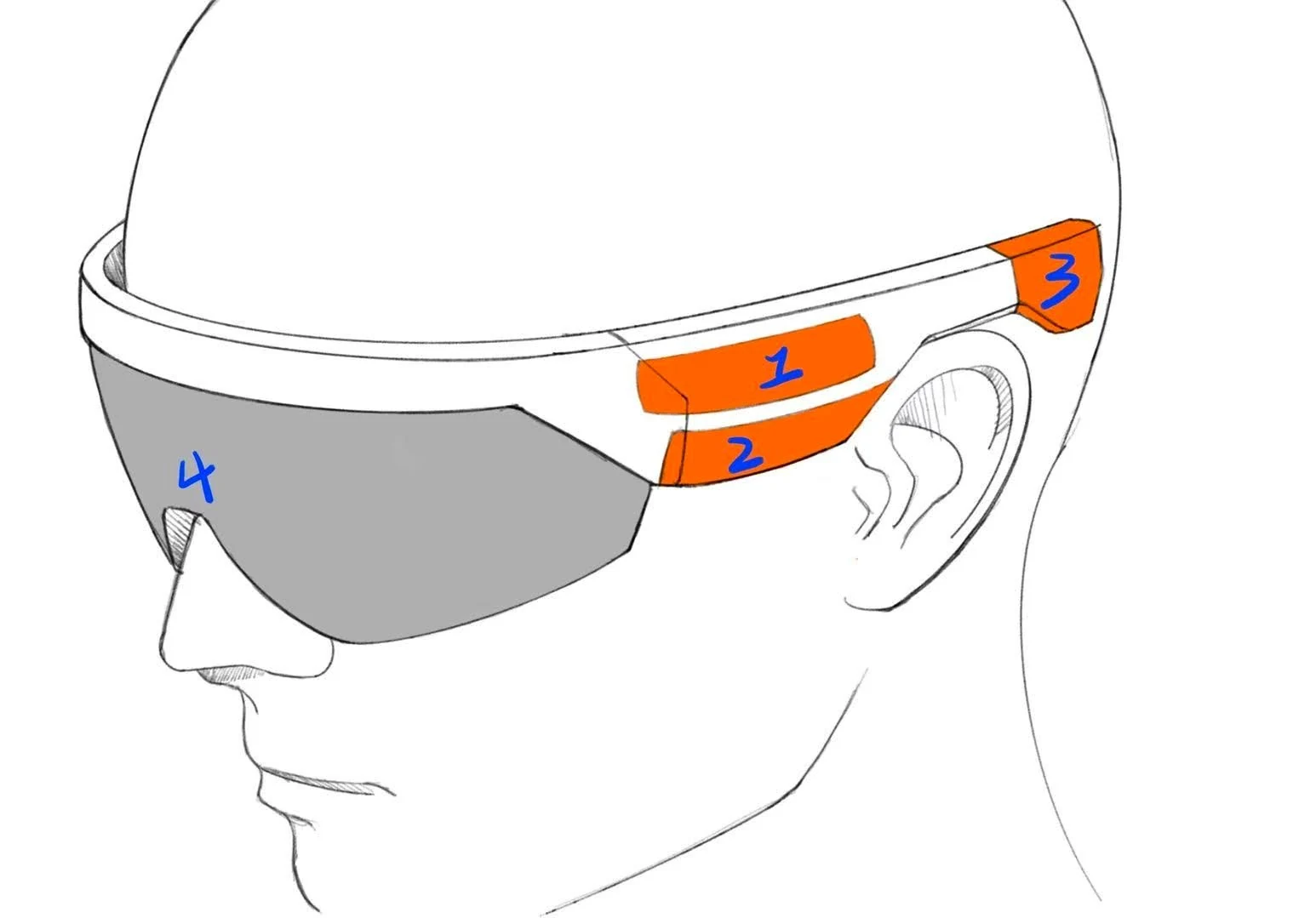
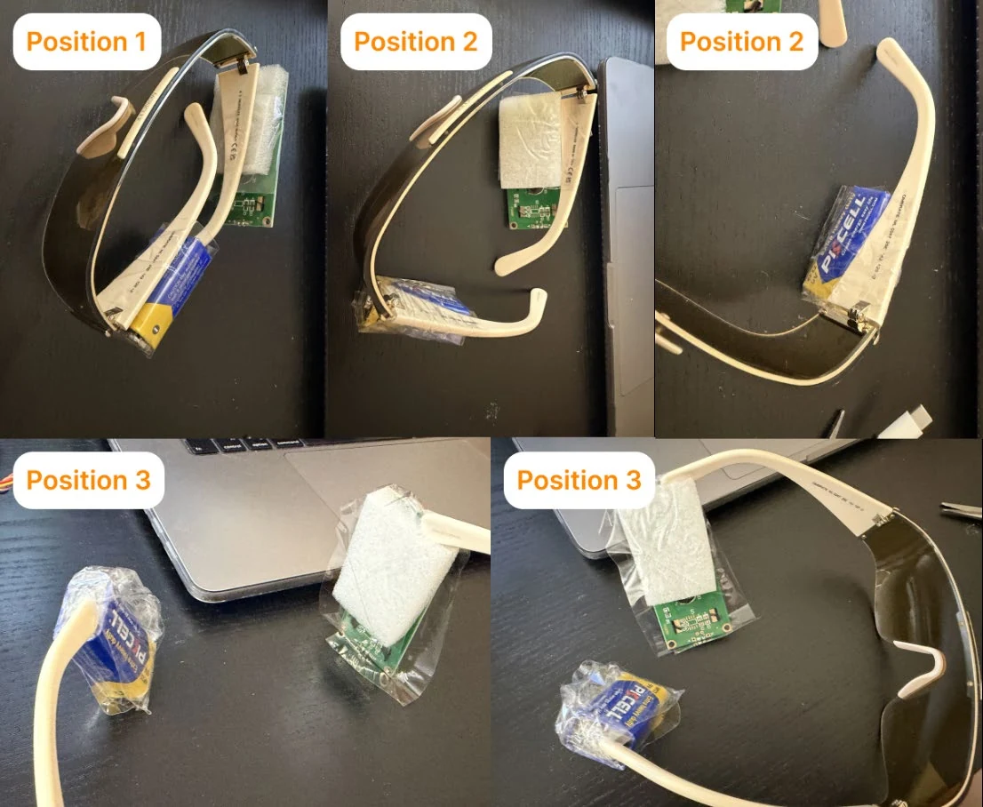
The study moved the battery to the mid-temple; the mechanism translated that location into a reliable field action.
实验把电池移到镜腿中段;机构设计再把这个位置转化为可靠的野外操作。
Study setup — n=6; four positions; two ≈20 g simulated masses; walking and head movement included.
实验设置 — n=6;四个位置;两个约 20 g 模拟配重;包含行走与头部运动。Result — mid-temple +1.7, rear temple +0.5, front temple −0.2, front frame −2.3.
结果 — 镜腿中段 +1.7,镜腿后段 +0.5,镜腿前段 −0.2,镜框前部 −2.3。Mechanism — magnets align, pogo pins connect, and a snap-fit locks the cell: align → insert → lock.
机构 — 磁铁对齐、pogo pin 接触、卡扣锁定:对齐 → 插入 → 锁定。Rejected — slides, hooks, and front-loaded concepts added friction, ambiguity, or facial weight.
淘汰方案 — 滑轨、挂钩与前置方案增加了摩擦、操作不确定性或面部负重。Field operation — temple holes support tactile location; the shoulder dock exposes spare cells for one-handed swaps.
野外操作 — 镜腿孔位帮助触觉定位,肩带充电坞让备用电池可单手取换。
The study moved the battery to the mid-temple; the mechanism translated that location into a reliable field action.
实验把电池移到镜腿中段;机构设计再把这个位置转化为可靠的野外操作。
Study setup — n=6; four positions; two ≈20 g simulated masses; walking and head movement included.
实验设置 — n=6;四个位置;两个约 20 g 模拟配重;包含行走与头部运动。Result — mid-temple +1.7, rear temple +0.5, front temple −0.2, front frame −2.3.
结果 — 镜腿中段 +1.7,镜腿后段 +0.5,镜腿前段 −0.2,镜框前部 −2.3。Mechanism — magnets align, pogo pins connect, and a snap-fit locks the cell: align → insert → lock.
机构 — 磁铁对齐、pogo pin 接触、卡扣锁定:对齐 → 插入 → 锁定。Rejected — slides, hooks, and front-loaded concepts added friction, ambiguity, or facial weight.
淘汰方案 — 滑轨、挂钩与前置方案增加了摩擦、操作不确定性或面部负重。Field operation — temple holes support tactile location; the shoulder dock exposes spare cells for one-handed swaps.
野外操作 — 镜腿孔位帮助触觉定位,肩带充电坞让备用电池可单手取换。
The study moved the battery to the mid-temple; the mechanism translated that location into a reliable field action.
实验把电池移到镜腿中段;机构设计再把这个位置转化为可靠的野外操作。
Study setup — n=6; four positions; two ≈20 g simulated masses; walking and head movement included.
实验设置 — n=6;四个位置;两个约 20 g 模拟配重;包含行走与头部运动。Result — mid-temple +1.7, rear temple +0.5, front temple −0.2, front frame −2.3.
结果 — 镜腿中段 +1.7,镜腿后段 +0.5,镜腿前段 −0.2,镜框前部 −2.3。Mechanism — magnets align, pogo pins connect, and a snap-fit locks the cell: align → insert → lock.
机构 — 磁铁对齐、pogo pin 接触、卡扣锁定:对齐 → 插入 → 锁定。Rejected — slides, hooks, and front-loaded concepts added friction, ambiguity, or facial weight.
淘汰方案 — 滑轨、挂钩与前置方案增加了摩擦、操作不确定性或面部负重。Field operation — temple holes support tactile location; the shoulder dock exposes spare cells for one-handed swaps.
野外操作 — 镜腿孔位帮助触觉定位,肩带充电坞让备用电池可单手取换。


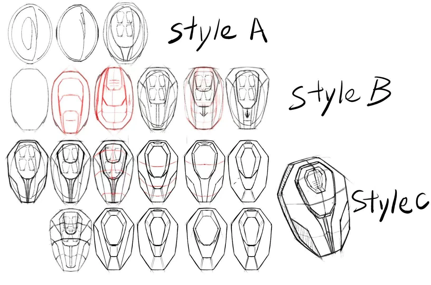
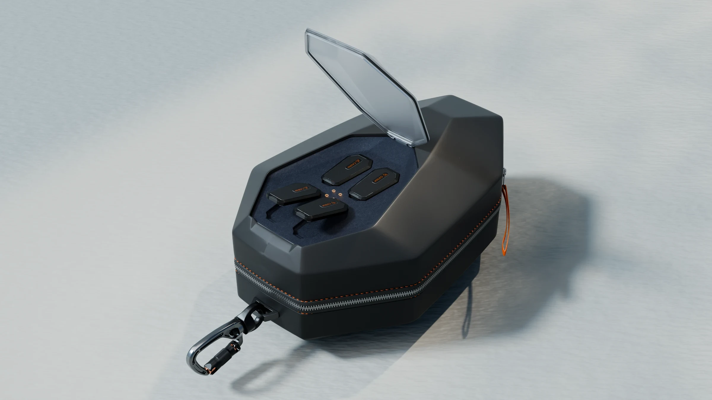
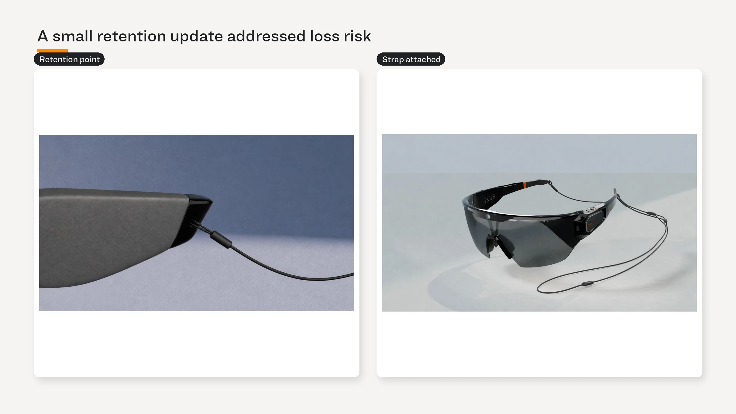
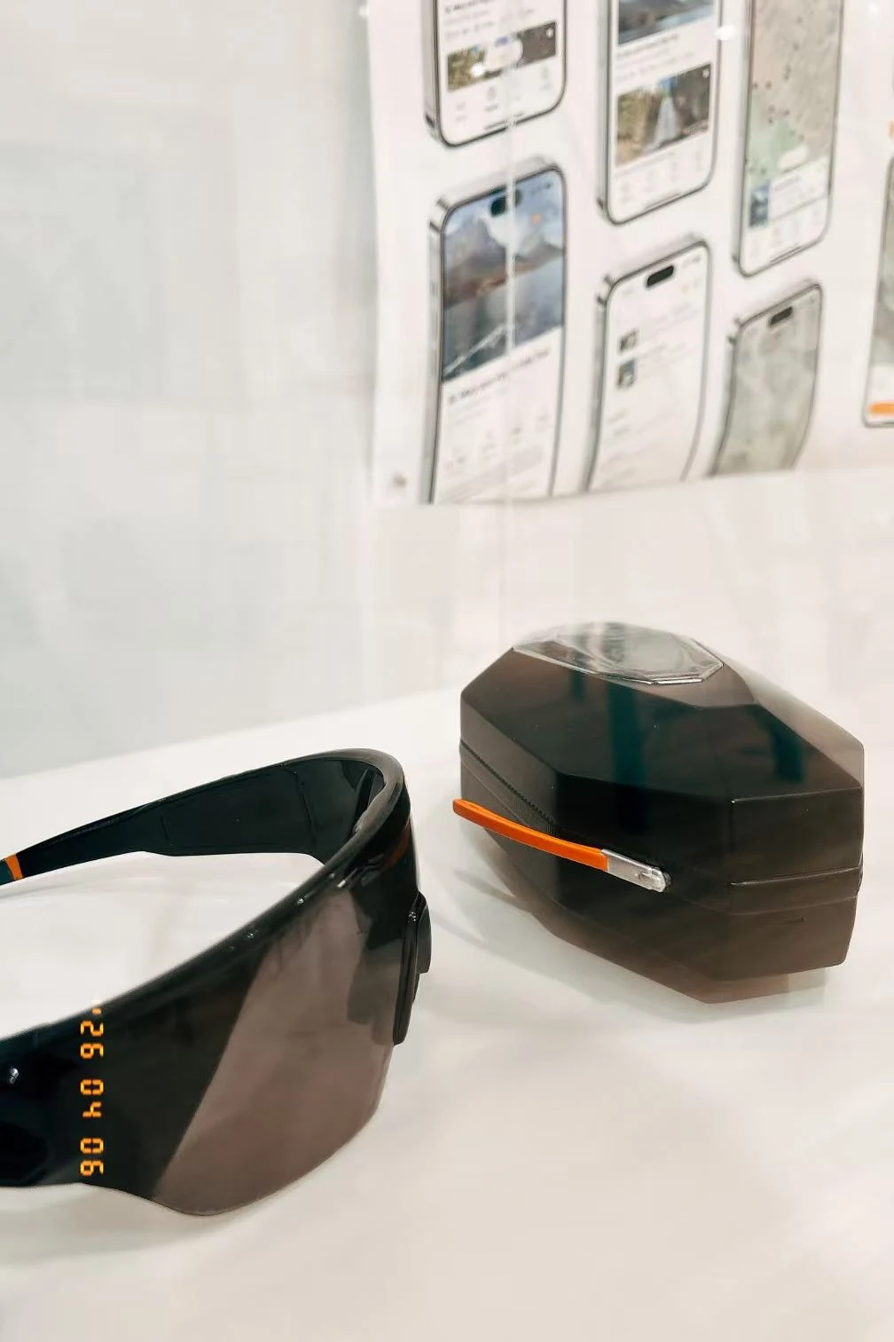
Prototype — 1:1 model
Prototype — 1:1 model
Prototype — 1:1 model
Testing & evidence boundary
Testing & evidence boundary
Testing & evidence boundary
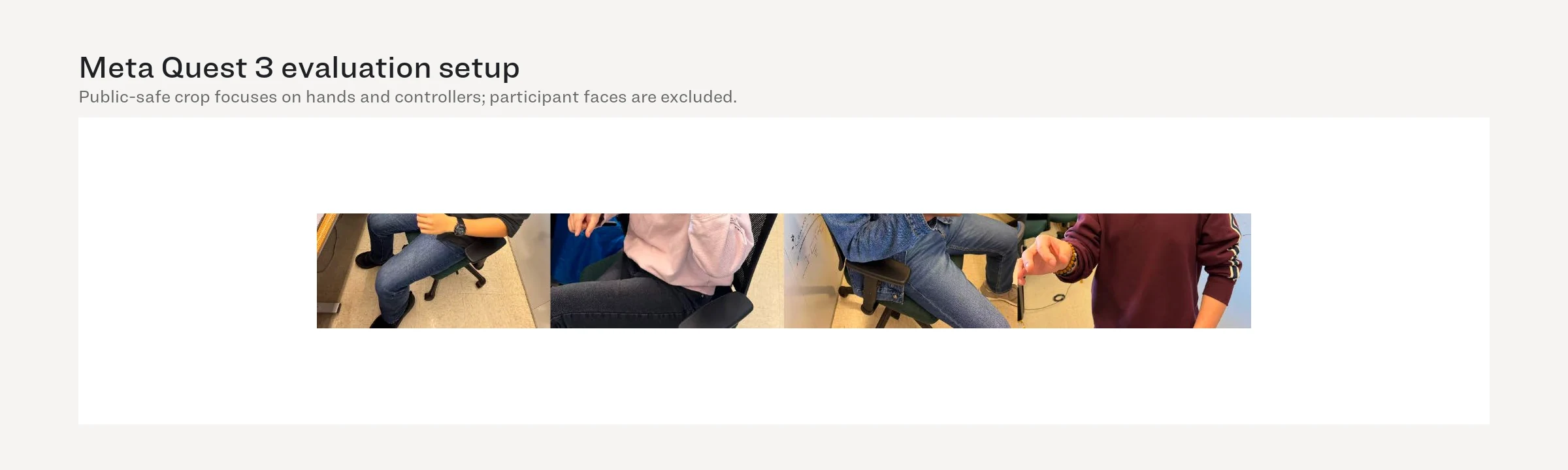
Seven participants completed eight tasks across AR, phone, and physical prototypes. The indoor study tested comprehension—not field performance.
7 名参与者在 AR、手机与实体原型上完成 8 项任务。室内研究测试的是理解度,而不是野外表现。
Evidence boundary — the AR prototype was a flat Figma flow centered in a Quest 3 browser, not a spatially anchored implementation.
证据边界 — AR 原型是在 Quest 3 浏览器中居中显示的平面 Figma 流程,并非空间锚定实现。
Seven participants completed eight tasks across AR, phone, and physical prototypes. The indoor study tested comprehension—not field performance.
7 名参与者在 AR、手机与实体原型上完成 8 项任务。室内研究测试的是理解度,而不是野外表现。
Evidence boundary — the AR prototype was a flat Figma flow centered in a Quest 3 browser, not a spatially anchored implementation.
证据边界 — AR 原型是在 Quest 3 浏览器中居中显示的平面 Figma 流程,并非空间锚定实现。
Seven participants completed eight tasks across AR, phone, and physical prototypes. The indoor study tested comprehension—not field performance.
7 名参与者在 AR、手机与实体原型上完成 8 项任务。室内研究测试的是理解度,而不是野外表现。
Evidence boundary — the AR prototype was a flat Figma flow centered in a Quest 3 browser, not a spatially anchored implementation.
证据边界 — AR 原型是在 Quest 3 浏览器中居中显示的平面 Figma 流程,并非空间锚定实现。
What testing changed
What testing changed
What testing changed
The evaluation was most useful when participants misunderstood a state, not when they completed a task quickly.
评估最有价值的时刻不是任务完成得快,而是参与者误解某个状态时。
Landmark guidance — add directional context and status so a highlight reads as navigation, not decoration.
地标引导 — 增加方向上下文与状态,让高亮被理解为导航而非装饰。Bearing — simplify the range and strengthen the relationship between heading and target.
方位 — 简化方向范围,并强化当前朝向与目标之间的关系。Switch Landmark — make the result of the switch explicit after confirmation.
切换地标 — 确认后明确展示切换结果。Wristband — add tactile retention and clarify the physical confirmation model.
腕带 — 增加触觉保持结构,并明确实体确认方式。
Two improvements removed information — less visual noise made the intended action clearer.
两项改进通过删减信息完成 — 更少的视觉噪声反而让意图更清晰。
The evaluation was most useful when participants misunderstood a state, not when they completed a task quickly.
评估最有价值的时刻不是任务完成得快,而是参与者误解某个状态时。
Landmark guidance — add directional context and status so a highlight reads as navigation, not decoration.
地标引导 — 增加方向上下文与状态,让高亮被理解为导航而非装饰。Bearing — simplify the range and strengthen the relationship between heading and target.
方位 — 简化方向范围,并强化当前朝向与目标之间的关系。Switch Landmark — make the result of the switch explicit after confirmation.
切换地标 — 确认后明确展示切换结果。Wristband — add tactile retention and clarify the physical confirmation model.
腕带 — 增加触觉保持结构,并明确实体确认方式。
Two improvements removed information — less visual noise made the intended action clearer.
两项改进通过删减信息完成 — 更少的视觉噪声反而让意图更清晰。
The evaluation was most useful when participants misunderstood a state, not when they completed a task quickly.
评估最有价值的时刻不是任务完成得快,而是参与者误解某个状态时。
Landmark guidance — add directional context and status so a highlight reads as navigation, not decoration.
地标引导 — 增加方向上下文与状态,让高亮被理解为导航而非装饰。Bearing — simplify the range and strengthen the relationship between heading and target.
方位 — 简化方向范围,并强化当前朝向与目标之间的关系。Switch Landmark — make the result of the switch explicit after confirmation.
切换地标 — 确认后明确展示切换结果。Wristband — add tactile retention and clarify the physical confirmation model.
腕带 — 增加触觉保持结构,并明确实体确认方式。
Two improvements removed information — less visual noise made the intended action clearer.
两项改进通过删减信息完成 — 更少的视觉噪声反而让意图更清晰。


Evidence boundary
Evidence boundary
Evidence boundary
The prototype supports a design argument, not a claim of field readiness.
这个原型支撑的是设计论证,而不是已经可用于野外的结论。
Prototype reality — AR was evaluated as a flat screen in Quest 3; spatial anchoring, outdoor legibility, and sensor behavior remain untested.
原型现实 — AR 以 Quest 3 中的平面界面评估;空间锚定、户外可读性与传感器行为尚未测试。Missing baseline — there was no comparison against a phone-only navigation condition.
缺失基线 — 尚未与仅使用手机导航的条件进行对照。Sample boundary — n=7 for prototype evaluation and n=6 for ergonomics; results indicate comprehension and comfort direction, not population-level validation.
样本边界 — 原型评估 n=7、人因实验 n=6;结果只能说明理解与舒适度方向,不能代表总体验证。First field test — compare glance time, route recovery, terrain attention, and physical control under sun, gloves, fatigue, and changing weather.
首轮野外测试 — 在阳光、手套、疲劳与天气变化中比较查看时长、路线恢复、地形注意力与实体控制。
The prototype supports a design argument, not a claim of field readiness.
这个原型支撑的是设计论证,而不是已经可用于野外的结论。
Prototype reality — AR was evaluated as a flat screen in Quest 3; spatial anchoring, outdoor legibility, and sensor behavior remain untested.
原型现实 — AR 以 Quest 3 中的平面界面评估;空间锚定、户外可读性与传感器行为尚未测试。Missing baseline — there was no comparison against a phone-only navigation condition.
缺失基线 — 尚未与仅使用手机导航的条件进行对照。Sample boundary — n=7 for prototype evaluation and n=6 for ergonomics; results indicate comprehension and comfort direction, not population-level validation.
样本边界 — 原型评估 n=7、人因实验 n=6;结果只能说明理解与舒适度方向,不能代表总体验证。First field test — compare glance time, route recovery, terrain attention, and physical control under sun, gloves, fatigue, and changing weather.
首轮野外测试 — 在阳光、手套、疲劳与天气变化中比较查看时长、路线恢复、地形注意力与实体控制。
The prototype supports a design argument, not a claim of field readiness.
这个原型支撑的是设计论证,而不是已经可用于野外的结论。
Prototype reality — AR was evaluated as a flat screen in Quest 3; spatial anchoring, outdoor legibility, and sensor behavior remain untested.
原型现实 — AR 以 Quest 3 中的平面界面评估;空间锚定、户外可读性与传感器行为尚未测试。Missing baseline — there was no comparison against a phone-only navigation condition.
缺失基线 — 尚未与仅使用手机导航的条件进行对照。Sample boundary — n=7 for prototype evaluation and n=6 for ergonomics; results indicate comprehension and comfort direction, not population-level validation.
样本边界 — 原型评估 n=7、人因实验 n=6;结果只能说明理解与舒适度方向,不能代表总体验证。First field test — compare glance time, route recovery, terrain attention, and physical control under sun, gloves, fatigue, and changing weather.
首轮野外测试 — 在阳光、手套、疲劳与天气变化中比较查看时长、路线恢复、地形注意力与实体控制。
Contact Me
Ready to bring your vision to life? Let's connect and explore the possibilities together. Reach out today!
2026 All rights reserved. Design by Shankun Zhou.
Contact Me
Ready to bring your vision to life? Let's connect and explore the possibilities together. Reach out today!
2026 All rights reserved. Design by Shankun Zhou.
Contact Me
Ready to bring your vision to life? Let's connect and explore the possibilities together. Reach out today!
2026 All rights reserved. Design by Shankun Zhou.